Dynamic Panels
OI enables embedded panels, overlays, and modals through a system called Dynamic Panels. Dynamic panels are screens with special properties which lets them be displayed over or within traditional screens.
Alarm Screens
Alarm screens are created when the alarm system is enabled. Once created, you can customize the display and functionality of the screens by editing them in OIB. You can also reset the screens to their defaults if needed. See more in the Alarms Manual.
Embedded Panels
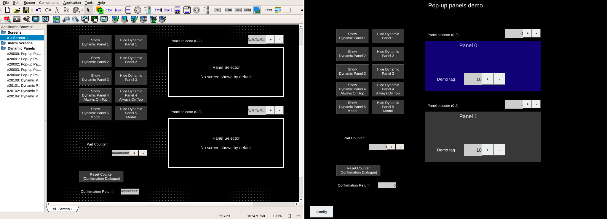
Dynamic panels can be embedded within a screen by using the Panel Selector Component.
Panel Selectors can reference a single dynamic panel which can be useful to:
reduce duplication for navigation components by creating a "navbar" type panel
reduce duplication for machine status, message banners, or other elements that are common across many screens
group a complicated set of components together into a cohesive unit
Panel Selectors can also switch between multiple panels which can be useful to:
provide different views for a screen without duplicating screens such as a view of a fixture for operators and a different view for maintenance
switch which controls are displayed based on machine status
Warning
In order to simplify the dynamic panel system, dynamic panels cannot contain other dynamic panels (Panel Selectors).
Overlays
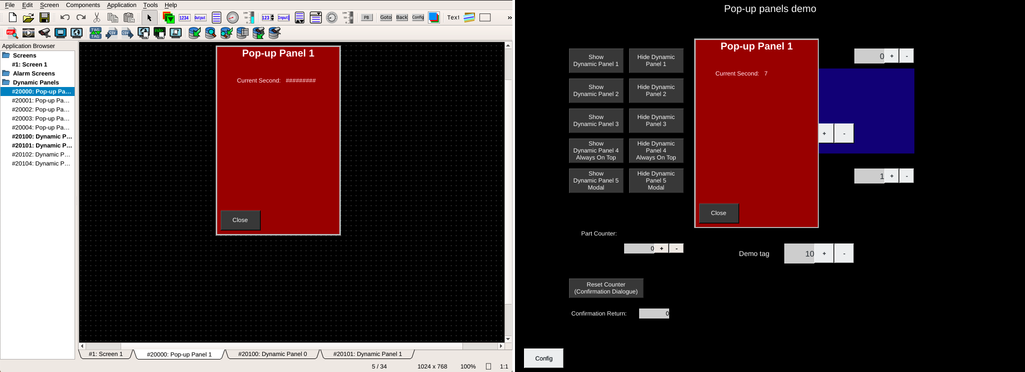
Overlays are dynamic panels that are triggered by setting the showTag tag on the dynamic panel's properties. When this tag is set and the value is a numeric non-zero number, the contents of the panel are overlaid the current screen (the background is not displayed). The components on the screen below are still visible and can be interacted with.
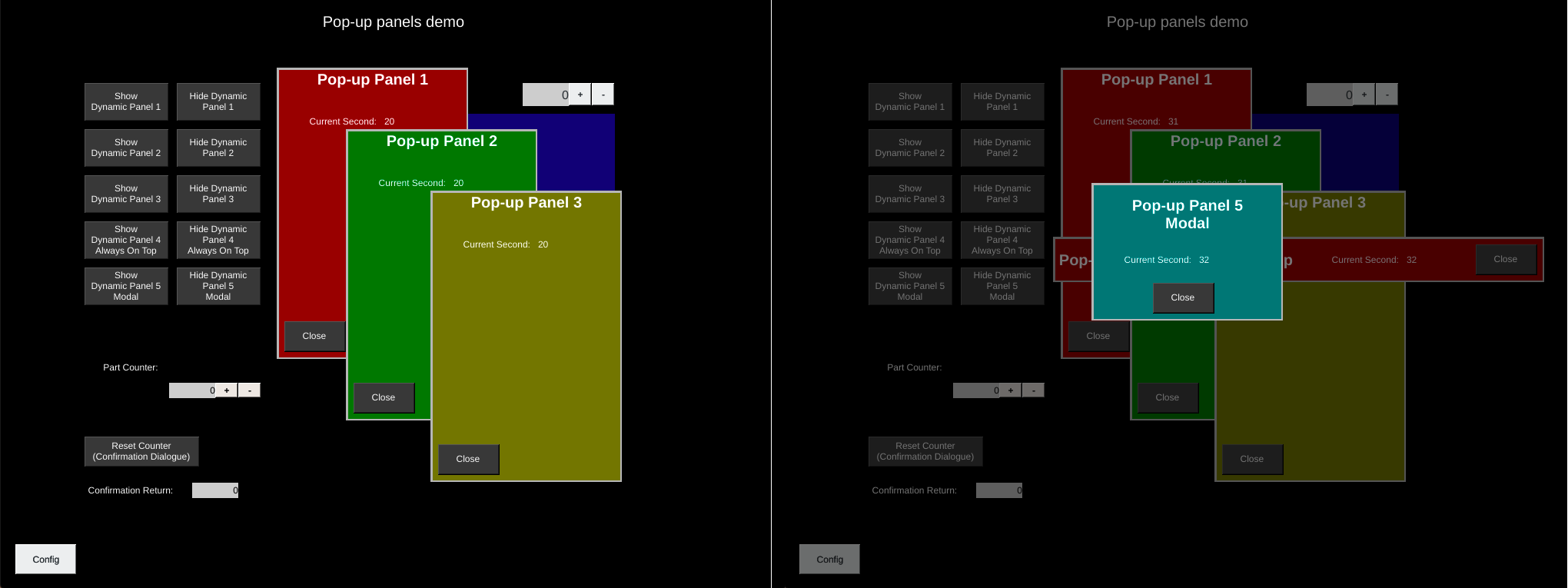
Multiple overlays can be displayed at the same time. The alwaysOnTop property sets whether the dynamic panel should be displayed over other overlays.
Note
Overlays are displayed in order of triggering with the newest on top. If multiple alwaysOnTop overlays are triggered, that group is displayed in order of triggering. The group of alwaysOnTop panels will always be displayed on top of panels that are not alwaysOnTop.
Modals are displayed over other panels.
Modals
Modals are special overlays that prevent interaction with the other elements on the display. The screen is dimmed and the dynamic panel displayed until the showTag value is returned to 0 (or a non-integer value).
Modals are displayed over all other panels.
To set a dynamic panel as a modal, edit the dynamic panel's properties and set isModal to true.
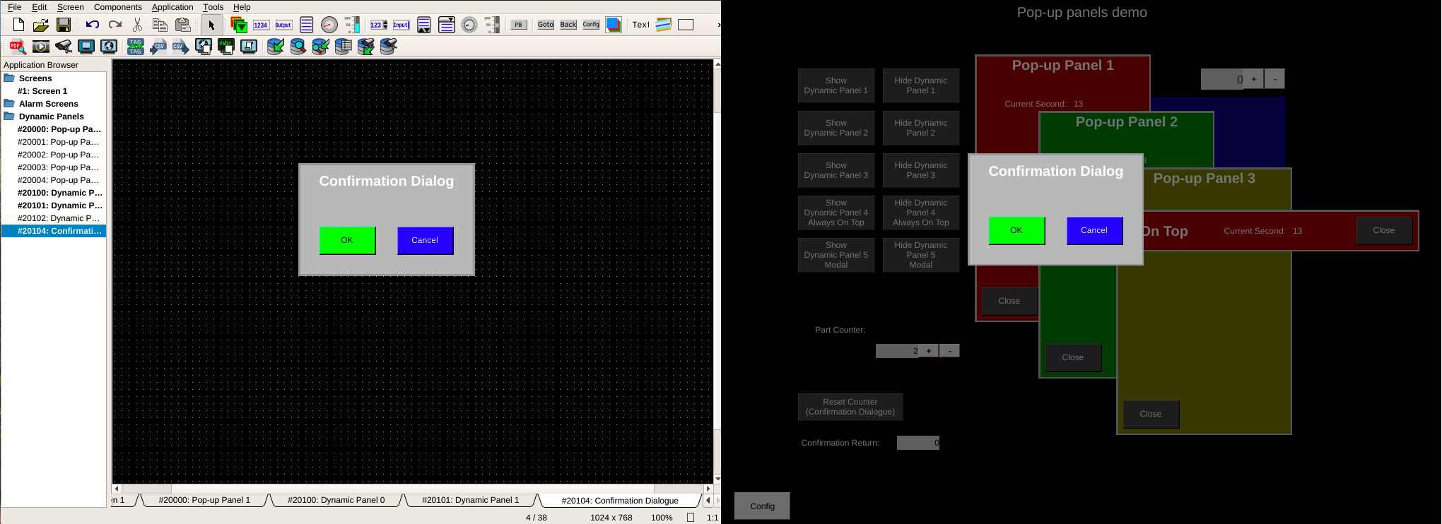
Confirmation Dialogs
Push Buttons and Screen Selectors can trigger a special type of modal by using the confirmationPanelNumber and confirmationReadTag attributes.
The confirmationPanelNumber represents the Dynamic Panel Screen # that will be displayed when the button is pressed.
OI does not have a pre-built confirmation dialog, rather the confirmationReadTag controls whether OI will hide the dialog (and write values if the writeTag and writeValue is set on the Push Button).
To use the dynamic panel with pushbuttons, create a dynamic panel that will be used as a confirmation dialog. Then, create buttons that will set the confirmationReadTag to either:
1 to confirm and write the pushValue and releaseValue to the button's writeTag, or
2 to cancel the action.
Tip
Set isModal to true on the dynamic panel you will be using for your confirmation dialog. This will darken the screen below the dialog and prevent interacting with those elements.
Using the dynamic panel with screen selectors is similar to push buttons with the exception that instead of writing values to the write tag the screen number is either changed or cancelled.
A common use case is confirming resets of counters: set the pushValue and releaseValue to "0", set the writeTag to the tag for the counter, and create a dynamic panel that provides a confirmation dialog for resetting the counter. This feature can also be used to prompt the operator before triggering actions that could be difficult to undo.
Authorization utilities still work with the confirmation system. So authorization can be required to prompt the confirmation, or on buttons within the dialog.
Note
Confirmation dialogs can be cancelled by pressing the Escape key on a connected keyboard.
Dynamic Panel Properties
| Property | Values | Description |
|---|---|---|
| name | string | Provide a name for the component. This can be helpful when using the "Used Components" tool in the tag editor. |
| description | string | A space to provide a description of the current component, useful for documenting intent. |
| authorize | freeAccess, useLoggedUser, onEachAccess | Determines access protections for this component. |
| allowedGroups | int | Integer value for which groups should be allowed to interact with this component. |
| accessTimeout | seconds (int) | (deprecated) When set, this will persist authorization for access to the component for the time specified. |
| accessPassword | string | (deprecated) When set, this password is required to use the component. |
| showTag | tag | Tag which will trigger showing this component or dynamic panel. |
| backcolor | color | Sets background color. Images are allowed to set this to transparent to support images with alpha masks. |
| screenNumber | int | This defines the number value for this screen. Used in goto-screen selectors, and in the application control and status tags to communicate current screen information to a PLC. |
| grid | x, y | (deprecated) Defines the x/y spacing of grid in OI. |
| allowPLC | true, false | Defines whether a PLC can override the User Access system when calling this screen. |
| isOverlay | boolean | Property for screen that determines whether the screen acts as an overlay instead of a normal screen. |
| alwaysOnTop | boolean | When true, this overlay will always be displayed over other overlays that do not have this property set to true, even if those overlays are triggered later. |
| isModal | boolean | When true, this overlay will visually dim the underlying screen and prevent interactions with elements outside the overlay. |