Indicators
Indictors are dynamic components used to display tag values in different ways. These can be generally grouped by how they interpret tag values:
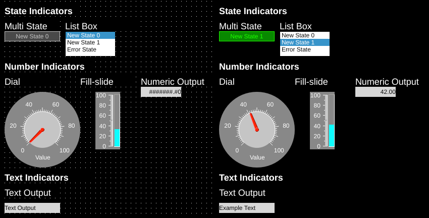
State Indicators show discrete states based on the value of the tag
Number Indicators show numeric values and can scale and round the value of the tag.
Text Indicators show the tag value as a string.
Multistate Indicator
| Property | Values | Description |
|---|---|---|
| name | string | Provide a name for the component. This can be helpful when using the "Used Components" tool in the tag editor. |
| description | string | A space to provide a description of the current component, useful for documenting intent. |
| geometry | x, y, width, height (ints) | Sets the visible geometry of the component: x and y from top left corner, and width/height. Editing these values can be useful when positioning/sizing finer than grid snap is needed. |
| hideTag | tag | When tag value is an integer other than zero, the component is not displayed on the screen. |
| readTag | tag | Tag specifies where to read the data that will be displayed. |
| foreColor | color | Sets foreground color (usually text). |
| backcolor | color | Sets background color. Images are allowed to set this to transparent to support images with alpha masks. |
| rotationTag | tag | Read tag – value defined in degrees the image is rotated around the rotationOrigin point. |
| offsetEnabled | true, false | Defines if offset property should be taken into account or should be ignored (applicable only for Multi-state indicator – images are placed by default in the center of the component). |
| offset | x, y (ints) | Distance image will be translated. |
| rotationOrigin | x, y (ints) | Sets rotation point of the component. Values are relative to the top-left of the component (0,0). |
| rotation | int | Number of degrees the image is rotated around rotationOrigin point. The rotation value will be applied to the component when OI screen is loaded and rotationTag is missing, or before rotationTag value is read from PLC. This property is useful for testing rotated images in OIB during development. Default value is 0. |
| stateTextWriteTag | tag | Write tag – writes the contents of the current states text to this tag. |
| stateTextChanged | tag | Write tag – writes to this tag when the state changes. Write values alternate between 0 and 1. |
| foreBlink | true, false | When true, text will blink between transparent and foreColor. |
| backBlink | true, false | When true, the background will blink between backColor and blinkColor. |
| blinkColor | color | Sets the color the background will change to while blinking. |
| hidden | true, false | When true, the component will not be visible on the screen. |
| tagValue | int/string | In the state editor for the component, this sets the value of the state. When the tags value equals this value the component will select this state. If no state matches, the Error state will be displayed. |
| readTagValueLogic | Equal, RangeGreater, RangeGreaterEqual, RangeLesser, RangeLesserEqual | Sets the logic that will be applied against the read tag. To evaluate, OI will build a comparison with the readTag value on the left, the logic type as the comparison, and the tagValue defined in the component on the right (such as a state’s tagValue). |
| text | text | Sets the text that is displayed on the component. |
| textSize | int (points) | Sets the text size in points. |
| textBold | true, false | When true, the text will be displayed in heavier type. |
| borderWidth | int (pixels) | Set the size of the border in pixels. 0 removes the border. |
| clickThrough | true, false | When true, click/touch events are passed through this element to elements underneath. This can be used to allow portions of an image to be buttons without needing a button to be displayed over that section of image. |
| image | image | The image that will be displayed. Images are selected from the applications image collection. |
| monoImage | true, false | When true, converts the image to black and white. |
| scaledImage | true, false | When true, scales the image to the size of the component. When false, the image is painted 1:1 scale, and any pixels outside the component area are not painted. |
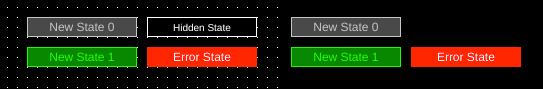
Multistate indicators are components whose display is determined by the state of their readTag. As the value of the readTag is changed, the state of the Multistate indicator is changed.
The component supports the ability to switch between thousands of states. If the readTag value goes to a state that is not in the list, the Error state will be displayed. These states can be customized using the State editor.
Multistate indicators support displaying text as well as images. Images are displayed by default in the center of the component and can be offset and rotated by using the Offset properties (these are applied to all states equally).
Rotation properties are global for all states - each state cannot be controlled individually.
Rotation only applies to the image, not the text.
Note
If offsetEnabled is true, offset is applied relative to the top left component corner.
Then rotation is applied around the rotationOrigin relative to the top left image (not component) corner.
If offsetEnabled is false, offset is ignored and rotation is applied around rotationOrigin relative to the image center.
To hide a particular state, set that state's hidden value to True.
stateTextWriteTag
A multistate indicator can be used to write text values to a tag through the stateTextWriteTag property. When a tag is set here and the state changes for the multistate indicator, the text value of that state is written to that tag. This can be an effective way of mapping numeric states to text representations back to a database or the PLC.
State ranges
Note
This feature is available with OI 1.11 Dec 30 2019 and newer.
Ranges of values instead of exact matches to values can be used to decide which state to display by using the "readTagValueLogic" property. This property determines how the readTag value is compared with the state's tagValue:
Equal (=) (default)
RangeGreater (>)
RangeGreaterEqual (>=)
RangeLesser(<)
RangeLesserEqual (<=)
OI will sort the states by tagValue, and then evaluate:
readTag value [Logic] state tagValue
Use the tool below to experiment and see how the different options affect the output.
| State: | Color: | tagValue |
| readTag Value: | Equal | Range Greater | Range Greater Equal | Range Lesser | Range Lesser Equal |
Numeric Output
| Property | Values | Description |
|---|---|---|
| name | string | Provide a name for the component. This can be helpful when using the "Used Components" tool in the tag editor. |
| description | string | A space to provide a description of the current component, useful for documenting intent. |
| geometry | x, y, width, height (ints) | Sets the visible geometry of the component: x and y from top left corner, and width/height. Editing these values can be useful when positioning/sizing finer than grid snap is needed. |
| hideTag | tag | When tag value is an integer other than zero, the component is not displayed on the screen. |
| readTag | tag | Tag specifies where to read the data that will be displayed. |
| foreColor | color | Sets foreground color (usually text). |
| backcolor | color | Sets background color. Images are allowed to set this to transparent to support images with alpha masks. |
| textSize | int (points) | Sets the text size in points. |
| textBold | true, false | When true, the text will be displayed in heavier type. |
| borderWidth | int (pixels) | Set the size of the border in pixels. 0 removes the border. |
| hAlignment | Left, Right, HCenter | Sets how the text is aligned on the component horizontally: left, right, or centered. |
| vAlignment | Top, Bottom, VCenter | Sets how the text is aligned on the component vertically: top, bottom, or center. |
| textWrap | true, false | When true, line breaks are inserted to keep long text within the horizontal space of the component. Text that extends past the bottom edge is not displayed. |
| clickThrough | true, false | When true, click/touch events are passed through this element to elements underneath. This can be used to allow portions of an image to be buttons without needing a button to be displayed over that section of image. |
| passwordMode | true, false | When true, the value of the readTag is obscured. |
| transparent | true, false | When true, the background is not painted. |
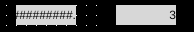
| fieldWidth | int | Sets the number of integers that the component will display/accept. If the number of digits is larger than this then the # symbol will be displayed in its place. Note: the decimal point is considered a digit itself. |
| decimalPointPosition | int (-1, 0, 1+) | Sets the number of digits that appear to the right of the decimal point. 0 will disable the decimal point, and -1 will attempt to automatically place the decimal based on the value of the number. When decimals are set, number values are rounded to fit, so 1.49 displayed on an input with 0 decimal places will be displayed as 1 and on an input with 1 decimal place will be displayed as 1.5. On inputs, numbers can be input manually on the keypad using more precision than the display shows: an input with 0 decimal places will accept 1.49 as a value and write 1.49 to the tags value but will show 1. |
| fillWithZeroes | true, false | When true, the number will be prepended with zeros up to fieldWidth. |
| scale | int | When true, will scale the value to be displayed. For inputs, the number will be unscaled when written: typing in 3 on a numeric input with a 2 scale will result in 1.5 being written to the tag. |
Numeric outputs display numeric values of data referenced through the readTag.
Numeric outputs support displaying up to twelve characters. Numeric outputs also provide control of the displayed number through the decimalPointPosition, fillWithZeroes, scale, and passwordMode.
Text Output
| Property | Values | Description |
|---|---|---|
| name | string | Provide a name for the component. This can be helpful when using the "Used Components" tool in the tag editor. |
| description | string | A space to provide a description of the current component, useful for documenting intent. |
| geometry | x, y, width, height (ints) | Sets the visible geometry of the component: x and y from top left corner, and width/height. Editing these values can be useful when positioning/sizing finer than grid snap is needed. |
| hideTag | tag | When tag value is an integer other than zero, the component is not displayed on the screen. |
| readTag | tag | Tag specifies where to read the data that will be displayed. |
| foreColor | color | Sets foreground color (usually text). |
| backcolor | color | Sets background color. Images are allowed to set this to transparent to support images with alpha masks. |
| textSize | int (points) | Sets the text size in points. |
| textBold | true, false | When true, the text will be displayed in heavier type. |
| borderWidth | int (pixels) | Set the size of the border in pixels. 0 removes the border. |
| hAlignment | Left, Right, HCenter | Sets how the text is aligned on the component horizontally: left, right, or centered. |
| vAlignment | Top, Bottom, VCenter | Sets how the text is aligned on the component vertically: top, bottom, or center. |
| textWrap | true, false | When true, line breaks are inserted to keep long text within the horizontal space of the component. Text that extends past the bottom edge is not displayed. |
| clickThrough | true, false | When true, click/touch events are passed through this element to elements underneath. This can be used to allow portions of an image to be buttons without needing a button to be displayed over that section of image. |
| passwordMode | true, false | When true, the value of the readTag is obscured. |
| transparent | true, false | When true, the background is not painted. |
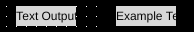
Text outputs display string/character array values of data referenced through the readTag.
Listbox
| Property | Values | Description |
|---|---|---|
| name | string | Provide a name for the component. This can be helpful when using the "Used Components" tool in the tag editor. |
| description | string | A space to provide a description of the current component, useful for documenting intent. |
| geometry | x, y, width, height (ints) | Sets the visible geometry of the component: x and y from top left corner, and width/height. Editing these values can be useful when positioning/sizing finer than grid snap is needed. |
| hideTag | tag | When tag value is an integer other than zero, the component is not displayed on the screen. |
| readTag | tag | Tag specifies where to read the data that will be displayed. |
| foreColor | color | Sets foreground color (usually text). |
| backcolor | color | Sets background color. Images are allowed to set this to transparent to support images with alpha masks. |
| highlightForeColor | color | Sets text color for selected list item. |
| hightlightBackColor | color | Sets background color for selected list item. |
| textSize | int (points) | Sets the text size in points. |
| textBold | true, false | When true, the text will be displayed in heavier type. |
| borderWidth | int (pixels) | Set the size of the border in pixels. 0 removes the border. |
| clickThrough | true, false | When true, click/touch events are passed through this element to elements underneath. This can be used to allow portions of an image to be buttons without needing a button to be displayed over that section of image. |
| filterInTag | tag | The string value of this tag is used to filter available choices on the component. States whose filterText matches the filterInTag according to the rules in filterMatchingMode will be kept in the list. The comparison is case sensitive. |
| filterOutTag | tag | The string value of this tag is used to filter available choices on the component. States whose filterText matches the filterInTag according to the rules in filterMatchingMode will be excluded from the list. The comparison is case sensitive. |
| filterMatchingMode | WholeWords AnyOccurrence | Sets the matching mode for list filters. WholeWords matches the whole filterText against the filterInTag/filterOutTag, whereas AnyOccurrence will match the tag value within substrings of the filterText. |
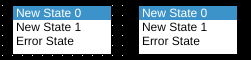
List boxes are used to simultaneously display a series of states, and to highlight the current state indicated by the readTag.
Listbox options are set using the state editor for the component.
In OI versions 1.14 and newer, the options shown on the input can be filtered using the filterInTag and filterOutTag.
Dial
| Property | Values | Description |
|---|---|---|
| name | string | Provide a name for the component. This can be helpful when using the "Used Components" tool in the tag editor. |
| description | string | A space to provide a description of the current component, useful for documenting intent. |
| geometry | x, y, width, height (ints) | Sets the visible geometry of the component: x and y from top left corner, and width/height. Editing these values can be useful when positioning/sizing finer than grid snap is needed. |
| hideTag | tag | When tag value is an integer other than zero, the component is not displayed on the screen. |
| readTag | tag | Tag specifies where to read the data that will be displayed. |
| backcolor | color | Sets background color. Images are allowed to set this to transparent to support images with alpha masks. |
| textColor | color | Sets the color of text. |
| scaleColor | color | Sets the color of the scale (tick marks). |
| dialColor | color | Sets the color of the center of the dial. |
| needleColor | color | Sets the color of the value-indicating needle. |
| scaleBackgroundColor | color | Sets the color of the outer ring of the dial. |
| rangeMin | int | Sets the minimum value the dial/slide displays. |
| rangeMax | int | Sets the maximum value the dial/slide displays. |
| multistate | true, false | When true, some of this component’s properties can be changed based on the state of the readvalue. |
| readTagValueLogic | Equal, RangeGreater, RangeGreaterEqual, RangeLesser, RangeLesserEqual | Sets the logic that will be applied against the read tag. To evaluate, OI will build a comparison with the readTag value on the left, the logic type as the comparison, and the tagValue defined in the component on the right (such as a state’s tagValue). |
| labelText | text | Sets the text that is displayed on the dials label. |
| textSize | int (points) | Sets the text size in points. |
| textBold | true, false | When true, the text will be displayed in heavier type. |
| clickThrough | true, false | When true, click/touch events are passed through this element to elements underneath. This can be used to allow portions of an image to be buttons without needing a button to be displayed over that section of image. |
| transparentBackground | true, false | When true, the component does not fill in space around displayed elements. |
| scale | int | When true, will scale the value to be displayed. For inputs, the number will be unscaled when written: typing in 3 on a numeric input with a 2 scale will result in 1.5 being written to the tag. |
| maxMajorTicks | int | Sets the maximum of major tick marks on the displays scale. |
| maxMinorTicks | int | Sets the maximum of minor tick marks on the displays scale. |
| rangeMinTag | int | Defines the rangeMin value of the component from the value of this tag. |
| rangeMaxTag | int | Defines the rangeMax value of the component from the value of this tag. |
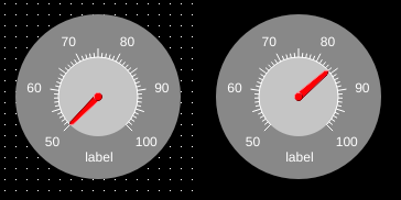
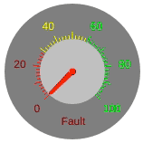
Dial indicators display numeric data referenced through the readTag through the use of a radial dial (analogous to a pressure gauge).
Dials support states for several properties. See the notes under Multistate Indicators for State Ranges.
Tick marks and numbers will show the colors they will be in for the calculated state. Other properties will change as the value changes.
Fill Slide
| Property | Values | Description |
|---|---|---|
| name | string | Provide a name for the component. This can be helpful when using the "Used Components" tool in the tag editor. |
| description | string | A space to provide a description of the current component, useful for documenting intent. |
| geometry | x, y, width, height (ints) | Sets the visible geometry of the component: x and y from top left corner, and width/height. Editing these values can be useful when positioning/sizing finer than grid snap is needed. |
| hideTag | tag | When tag value is an integer other than zero, the component is not displayed on the screen. |
| readTag | tag | Tag specifies where to read the data that will be displayed. |
| backcolor | color | Sets background color. Images are allowed to set this to transparent to support images with alpha masks. |
| textColor | color | Sets the color of text. |
| scaleColor | color | Sets the color of the scale (tick marks). |
| barColor | color | Sets the color of the value-bar. |
| rangeMin | int | Sets the minimum value the dial/slide displays. |
| rangeMax | int | Sets the maximum value the dial/slide displays. |
| multistate | true, false | When true, some of this component’s properties can be changed based on the state of the readvalue. |
| readTagValueLogic | Equal, RangeGreater, RangeGreaterEqual, RangeLesser, RangeLesserEqual | Sets the logic that will be applied against the read tag. To evaluate, OI will build a comparison with the readTag value on the left, the logic type as the comparison, and the tagValue defined in the component on the right (such as a state’s tagValue). |
| textSize | int (points) | Sets the text size in points. |
| textBold | true, false | When true, the text will be displayed in heavier type. |
| clickThrough | true, false | When true, click/touch events are passed through this element to elements underneath. This can be used to allow portions of an image to be buttons without needing a button to be displayed over that section of image. |
| scale | int | When true, will scale the value to be displayed. For inputs, the number will be unscaled when written: typing in 3 on a numeric input with a 2 scale will result in 1.5 being written to the tag. |
| orientation | Horizontal, Vertical | Sets the orientation of the component between a vertical slide or horizontal slide. |
| width | int | Sets the size of the slide (width for vertical, height for horizontal). Remaining space within the component is used for the scale. |
| maxMajorTicks | int | Sets the maximum of major tick marks on the displays scale. |
| maxMinorTicks | int | Sets the maximum of minor tick marks on the displays scale. |
| rangeMinTag | int | Defines the rangeMin value of the component from the value of this tag. |
| rangeMaxTag | int | Defines the rangeMax value of the component from the value of this tag. |
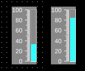
Fill slides display numeric data referenced through the readTag through the use of a linear bar.