Inputs
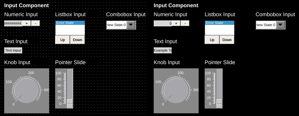
Inputs provide the ability to manipulate values in a PLC through the writeTag. Inputs are dynamic components and operate with writeTags as well as readTags.
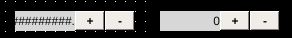
Numeric Input
| Property | Values | Description |
|---|---|---|
| name | string | Provide a name for the component. This can be helpful when using the "Used Components" tool in the tag editor. |
| description | string | A space to provide a description of the current component, useful for documenting intent. |
| geometry | x, y, width, height (ints) | Sets the visible geometry of the component: x and y from top left corner, and width/height. Editing these values can be useful when positioning/sizing finer than grid snap is needed. |
| authorize | freeAccess, useLoggedUser, onEachAccess | Determines access protections for this component. |
| allowedGroups | int | Integer value for which groups should be allowed to interact with this component. |
| accessTimeout | seconds (int) | (deprecated) When set, this will persist authorization for access to the component for the time specified. |
| accessPassword | string | (deprecated) When set, this password is required to use the component. |
| hideTag | tag | When tag value is an integer other than zero, the component is not displayed on the screen. |
| readTag | tag | Tag specifies where to read the data that will be displayed. |
| writeTag | tag | Tag specifies where the component will write data on changes. |
| disableTag | tag | When tag value is an integer other than zero, interaction with this component is disabled. |
| foreColor | color | Sets foreground color (usually text). |
| backcolor | color | Sets background color. Images are allowed to set this to transparent to support images with alpha masks. |
| disabledColor | color | Sets color of text when this input is disabled. |
| minValue | int | Sets the minimum value the component will accept. If a lesser value is entered manually an error will be displayed and keypad shown again. |
| maxValue | int | Sets the maximum value the component will accept. If a larger value is entered manually an error will be displayed and keypad shown again. |
| minValueTag | tag | When set, the component will read the value in this tag and use that for the minValue value. |
| maxValueTag | tag | When set, the component will read the value in this tag and use that for the maxValue value. |
| stepValue | int | Sets the amount the value changes when pressing the increment/decrement buttons. |
| keypad | true, false | When true, will display numeric keypad for entry. False will not display the keypad. |
| incDecButtons | true, false | When true, increment and decrement buttons are shown with the component. False will not display these buttons. |
| textSize | int (points) | Sets the text size in points. |
| textBold | true, false | When true, the text will be displayed in heavier type. |
| borderWidth | int (pixels) | Set the size of the border in pixels. 0 removes the border. |
| hAlignment | Left, Right, HCenter | Sets how the text is aligned on the component horizontally: left, right, or centered. |
| vAlignment | Top, Bottom, VCenter | Sets how the text is aligned on the component vertically: top, bottom, or center. |
| textWrap | true, false | When true, line breaks are inserted to keep long text within the horizontal space of the component. Text that extends past the bottom edge is not displayed. |
| passwordMode | true, false | When true, the value of the readTag is obscured. |
| transparent | true, false | When true, the background is not painted. |
| fieldWidth | int | Sets the number of integers that the component will display/accept. If the number of digits is larger than this then the # symbol will be displayed in its place. Note: the decimal point is considered a digit itself. |
| decimalPointPosition | int (-1, 0, 1+) | Sets the number of digits that appear to the right of the decimal point. 0 will disable the decimal point, and -1 will attempt to automatically place the decimal based on the value of the number. When decimals are set, number values are rounded to fit, so 1.49 displayed on an input with 0 decimal places will be displayed as 1 and on an input with 1 decimal place will be displayed as 1.5. On inputs, numbers can be input manually on the keypad using more precision than the display shows: an input with 0 decimal places will accept 1.49 as a value and write 1.49 to the tags value but will show 1. |
| fillWithZeroes | true, false | When true, the number will be prepended with zeros up to fieldWidth. |
| scale | int | When true, will scale the value to be displayed. For inputs, the number will be unscaled when written: typing in 3 on a numeric input with a 2 scale will result in 1.5 being written to the tag. |
Numeric inputs are used to interact with numeric data using the readTag and writeTag.
Optional increment/decrement buttons are provided, as well as several properties to control the display and formatting of numeric data.
Options such as minValue and maxValue provide a method to filter and validate entered data. When a scale other than 1 is set, the entered values are scaled back as expected.
Note
Increment and decrement buttons are treated somewhat independently of the main component in OIB.
When creating numeric inputs, the size of the component specified is the size of the input readout only. Increase and decrease buttons are appended automatically in scale and alongside the input readout.
You can adjust the position and size of these through the property table or by selecting the numeric input and then selecting the individual buttons.
Note
Password mode can be enabled to conceal the values of inputs. The length of input can also be concealed by also enabling fillWithZeros and setting a value for fieldWidth
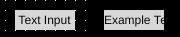
Text Input
| Property | Values | Description |
|---|---|---|
| name | string | Provide a name for the component. This can be helpful when using the "Used Components" tool in the tag editor. |
| description | string | A space to provide a description of the current component, useful for documenting intent. |
| authorize | freeAccess, useLoggedUser, onEachAccess | Determines access protections for this component. |
| allowedGroups | int | Integer value for which groups should be allowed to interact with this component. |
| accessTimeout | seconds (int) | (deprecated) When set, this will persist authorization for access to the component for the time specified. |
| accessPassword | string | (deprecated) When set, this password is required to use the component. |
| hideTag | tag | When tag value is an integer other than zero, the component is not displayed on the screen. |
| readTag | tag | Tag specifies where to read the data that will be displayed. |
| writeTag | tag | Tag specifies where the component will write data on changes. |
| disableTag | tag | When tag value is an integer other than zero, interaction with this component is disabled. |
| foreColor | color | Sets foreground color (usually text). |
| backcolor | color | Sets background color. Images are allowed to set this to transparent to support images with alpha masks. |
| disabledColor | color | Sets color of text when this input is disabled. |
| textSize | int (points) | Sets the text size in points. |
| textBold | true, false | When true, the text will be displayed in heavier type. |
| borderWidth | int (pixels) | Set the size of the border in pixels. 0 removes the border. |
| hAlignment | Left, Right, HCenter | Sets how the text is aligned on the component horizontally: left, right, or centered. |
| vAlignment | Top, Bottom, VCenter | Sets how the text is aligned on the component vertically: top, bottom, or center. |
| textWrap | true, false | When true, line breaks are inserted to keep long text within the horizontal space of the component. Text that extends past the bottom edge is not displayed. |
| passwordMode | true, false | When true, the value of the readTag is obscured. |
| transparent | true, false | When true, the background is not painted. |
Text outputs display string/character array values of data referenced through the readTag and allow an operator to change the value of the writeTag. Enabling password mode conceals the value of inputs.
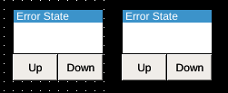
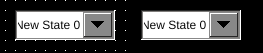
Listbox Input
| Property | Values | Description |
|---|---|---|
| name | string | Provide a name for the component. This can be helpful when using the "Used Components" tool in the tag editor. |
| description | string | A space to provide a description of the current component, useful for documenting intent. |
| geometry | x, y, width, height (ints) | Sets the visible geometry of the component: x and y from top left corner, and width/height. Editing these values can be useful when positioning/sizing finer than grid snap is needed. |
| authorize | freeAccess, useLoggedUser, onEachAccess | Determines access protections for this component. |
| allowedGroups | int | Integer value for which groups should be allowed to interact with this component. |
| accessTimeout | seconds (int) | (deprecated) When set, this will persist authorization for access to the component for the time specified. |
| accessPassword | string | (deprecated) When set, this password is required to use the component. |
| hideTag | tag | When tag value is an integer other than zero, the component is not displayed on the screen. |
| readTag | tag | Tag specifies where to read the data that will be displayed. |
| writeTag | tag | Tag specifies where the component will write data on changes. |
| foreColor | color | Sets foreground color (usually text). |
| backcolor | color | Sets background color. Images are allowed to set this to transparent to support images with alpha masks. |
| highlightForeColor | color | Sets text color for selected list item. |
| hightlightBackColor | color | Sets background color for selected list item. |
| textSize | int (points) | Sets the text size in points. |
| textBold | true, false | When true, the text will be displayed in heavier type. |
| borderWidth | int (pixels) | Set the size of the border in pixels. 0 removes the border. |
| clickThrough | true, false | When true, click/touch events are passed through this element to elements underneath. This can be used to allow portions of an image to be buttons without needing a button to be displayed over that section of image. |
| filterInTag | tag | The string value of this tag is used to filter available choices on the component. States whose filterText matches the filterInTag according to the rules in filterMatchingMode will be kept in the list. The comparison is case sensitive. |
| filterOutTag | tag | The string value of this tag is used to filter available choices on the component. States whose filterText matches the filterInTag according to the rules in filterMatchingMode will be excluded from the list. The comparison is case sensitive. |
| filterMatchingMode | WholeWords AnyOccurrence | Sets the matching mode for list filters. WholeWords matches the whole filterText against the filterInTag/filterOutTag, whereas AnyOccurrence will match the tag value within substrings of the filterText. |
List boxes are used to simultaneously display a series of states, highlight the current state indicated by the readTag, and allow an operator to select a state and update the value of the writeTag.
Listbox options are set using the state editor for the component.
In OI versions 1.14 and newer, the options shown on the input can be filtered using the filterInTag and filterOutTag.
Combo-box Input
| Property | Values | Description |
|---|---|---|
| name | string | Provide a name for the component. This can be helpful when using the "Used Components" tool in the tag editor. |
| description | string | A space to provide a description of the current component, useful for documenting intent. |
| geometry | x, y, width, height (ints) | Sets the visible geometry of the component: x and y from top left corner, and width/height. Editing these values can be useful when positioning/sizing finer than grid snap is needed. |
| hideTag | tag | When tag value is an integer other than zero, the component is not displayed on the screen. |
| readTag | tag | Tag specifies where to read the data that will be displayed. |
| writeTag | tag | Tag specifies where the component will write data on changes. |
| triggerRefreshTag | tag | Component will watch this tag to determine whether to trigger a refresh of its data. See triggerOnEvent property. |
| triggerOnEvent | ZeroToNonZero, AnyChange | Determines when a change in the triggerTag will be used to trigger an action. ZeroToNonzero will trigger only when the tag value goes from zero to a non-zero value, and anyChange will trigger on any change in value. |
| foreColor | color | Sets foreground color (usually text). |
| backcolor | color | Sets background color. Images are allowed to set this to transparent to support images with alpha masks. |
| highlightForeColor | color | Sets text color for selected list item. |
| hightlightBackColor | color | Sets background color for selected list item. |
| buttonForeColor | color | Sets the color of the drop-down buttons arrow. |
| buttonBackColor | color | Sets the color of the drop-down buttons background. |
| textSize | int (points) | Sets the text size in points. |
| textBold | true, false | When true, the text will be displayed in heavier type. |
| xmlRpcServer | string | Undocumented |
| xmlRpcFunction | string | Undocumented |
| xmlRpcParameters | string | Undocumented |
| filterInTag | tag | The string value of this tag is used to filter available choices on the component. States whose filterText matches the filterInTag according to the rules in filterMatchingMode will be kept in the list. The comparison is case sensitive. |
| filterOutTag | tag | The string value of this tag is used to filter available choices on the component. States whose filterText matches the filterInTag according to the rules in filterMatchingMode will be excluded from the list. The comparison is case sensitive. |
| filterMatchingMode | WholeWords AnyOccurrence | Sets the matching mode for list filters. WholeWords matches the whole filterText against the filterInTag/filterOutTag, whereas AnyOccurrence will match the tag value within substrings of the filterText. |
Combobox inputs provide functionality similar to listbox inputs. They display a series of states, showing only the currently selected state, and allow an operator to select a state and update the value of the writeTag.
The XML-RPC functionality works essentially as follows:
combo box read tag changed
xml-rpc request is constructed: xmlRpcParameters string is passed to xml-rpc method xmlRpcFunction and sent to url xmlRpcServer
xml-rpc response is expected to be list of pairs [string,string]
new states are created [tagValue,text] and appended to states created in oib's state editor
combo box works as normal, it lists all oib states + xml-rpx received states
Warning
Use of XML-RPC functionality is discouraged as it is rarely needed and requires external resources. It is rarely used and likely to be removed from future OI versions.
In OI versions 1.14 and newer, the options shown on the input can be filtered using the filterInTag and filterOutTag.
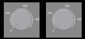
Knob Input
| Property | Values | Description |
|---|---|---|
| name | string | Provide a name for the component. This can be helpful when using the "Used Components" tool in the tag editor. |
| description | string | A space to provide a description of the current component, useful for documenting intent. |
| geometry | x, y, width, height (ints) | Sets the visible geometry of the component: x and y from top left corner, and width/height. Editing these values can be useful when positioning/sizing finer than grid snap is needed. |
| authorize | freeAccess, useLoggedUser, onEachAccess | Determines access protections for this component. |
| allowedGroups | int | Integer value for which groups should be allowed to interact with this component. |
| accessTimeout | seconds (int) | (deprecated) When set, this will persist authorization for access to the component for the time specified. |
| accessPassword | string | (deprecated) When set, this password is required to use the component. |
| hideTag | tag | When tag value is an integer other than zero, the component is not displayed on the screen. |
| readTag | tag | Tag specifies where to read the data that will be displayed. |
| writeTag | tag | Tag specifies where the component will write data on changes. |
| backcolor | color | Sets background color. Images are allowed to set this to transparent to support images with alpha masks. |
| textColor | color | Sets the color of text. |
| scaleColor | color | Sets the color of the scale (tick marks). |
| knobColor | color | Sets the color of the button used to slide. |
| knobMarkerColor | color | Sets the color of the position indictor on the knob. |
| rangeMin | int | Sets the minimum value the dial/slide displays. |
| rangeMax | int | Sets the maximum value the dial/slide displays. |
| scale | int | When true, will scale the value to be displayed. For inputs, the number will be unscaled when written: typing in 3 on a numeric input with a 2 scale will result in 1.5 being written to the tag. |
| maxMajorTicks | int | Sets the maximum of major tick marks on the displays scale. |
| maxMinorTicks | int | Sets the maximum of minor tick marks on the displays scale. |
| rangeMinTag | int | Defines the rangeMin value of the component from the value of this tag. |
| rangeMaxTag | int | Defines the rangeMax value of the component from the value of this tag. |
Knob input components display numerical data referenced through the readTag and allow an operator to change the value of the writeTag through the use of a radial dial (analogous to a pressure gauge).
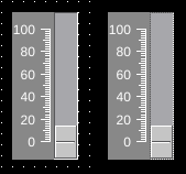
Pointer Slide
| Property | Values | Description |
|---|---|---|
| name | string | Provide a name for the component. This can be helpful when using the "Used Components" tool in the tag editor. |
| description | string | A space to provide a description of the current component, useful for documenting intent. |
| geometry | x, y, width, height (ints) | Sets the visible geometry of the component: x and y from top left corner, and width/height. Editing these values can be useful when positioning/sizing finer than grid snap is needed. |
| authorize | freeAccess, useLoggedUser, onEachAccess | Determines access protections for this component. |
| allowedGroups | int | Integer value for which groups should be allowed to interact with this component. |
| accessTimeout | seconds (int) | (deprecated) When set, this will persist authorization for access to the component for the time specified. |
| accessPassword | string | (deprecated) When set, this password is required to use the component. |
| hideTag | tag | When tag value is an integer other than zero, the component is not displayed on the screen. |
| readTag | tag | Tag specifies where to read the data that will be displayed. |
| writeTag | tag | Tag specifies where the component will write data on changes. |
| backcolor | color | Sets background color. Images are allowed to set this to transparent to support images with alpha masks. |
| textColor | color | Sets the color of text. |
| scaleColor | color | Sets the color of the scale (tick marks). |
| knobColor | color | Sets the color of the button used to slide. |
| slideAreaColor | color | Sets the color of the area the knob slides over. |
| rangeMin | int | Sets the minimum value the dial/slide displays. |
| rangeMax | int | Sets the maximum value the dial/slide displays. |
| scale | int | When true, will scale the value to be displayed. For inputs, the number will be unscaled when written: typing in 3 on a numeric input with a 2 scale will result in 1.5 being written to the tag. |
| orientation | Horizontal, Vertical | Sets the orientation of the component between a vertical slide or horizontal slide. |
| width | int | Sets the size of the slide (width for vertical, height for horizontal). Remaining space within the component is used for the scale. |
| maxMajorTicks | int | Sets the maximum of major tick marks on the displays scale. |
| maxMinorTicks | int | Sets the maximum of minor tick marks on the displays scale. |
| rangeMinTag | int | Defines the rangeMin value of the component from the value of this tag. |
| rangeMaxTag | int | Defines the rangeMax value of the component from the value of this tag. |
Pointer slides display numeric data referenced through the readTag and allow an operator to change the value of the writeTag through the use of a sliding button control.