Viewers

Viewers are components that allow you to access and view PDFs, videos, remote desktops, webcams, and web pages.
Warning
OI-Windows does not support PDF, Video, Remote, or Browser components. To provide the same functionality you must use the Generic Run Component to launch the appropriate programs.
PDF Viewer
| Property | Values | Description |
|---|---|---|
| name | string | Provide a name for the component. This can be helpful when using the "Used Components" tool in the tag editor. |
| description | string | A space to provide a description of the current component, useful for documenting intent. |
| geometry | x, y, width, height (ints) | Sets the visible geometry of the component: x and y from top left corner, and width/height. Editing these values can be useful when positioning/sizing finer than grid snap is needed. |
| authorize | freeAccess, useLoggedUser, onEachAccess | Determines access protections for this component. |
| allowedGroups | int | Integer value for which groups should be allowed to interact with this component. |
| accessTimeout | seconds (int) | (deprecated) When set, this will persist authorization for access to the component for the time specified. |
| accessPassword | string | (deprecated) When set, this password is required to use the component. |
| text | text | Sets the text that is displayed on the component. |
| textSize | int (points) | Sets the text size in points. |
| textBold | true, false | When true, the text will be displayed in heavier type. |
| image | image | The image that will be displayed. Images are selected from the applications image collection. |
| monoImage | true, false | When true, converts the image to black and white. |
| startupFile | string | Sets the file to load when the viewer is opened. |
| startupPage | int | Sets the page number to navigate to when the viewer is opened. |
| startupZoom | int | Sets the starting zoom factor when the component is opened. |
| showNavigator | true, false | When true, shows an overlay with navigation controls. |
| mayOpenFile | true, false | When true, operators can navigate and open other files. |
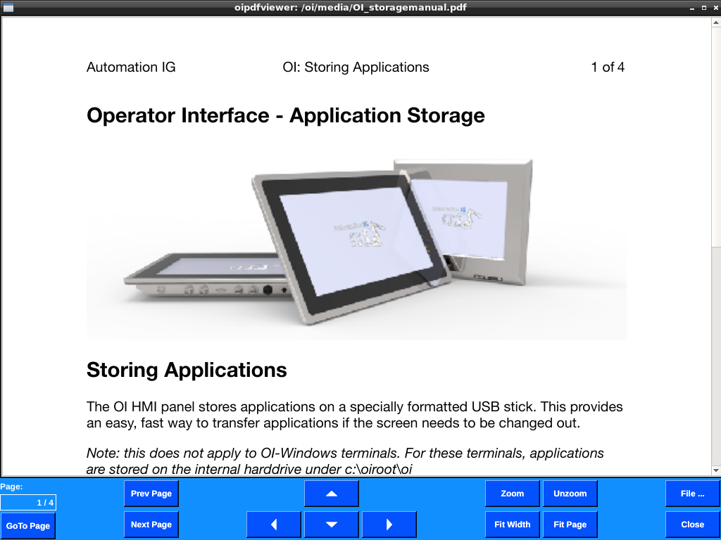
PDF viewer provides a method to display a PDF with onscreen navigation controls. Useful for work instructions, forms, and manuals, the component can be configured to open a specific PDF or allow operators to select which PDF to display.
Warning
PDF Viewer is not supported in OI-windows. Please use Generic Run to launch a program of your choosing.
Video Viewer
| Property | Values | Description |
|---|---|---|
| name | string | Provide a name for the component. This can be helpful when using the "Used Components" tool in the tag editor. |
| description | string | A space to provide a description of the current component, useful for documenting intent. |
| geometry | x, y, width, height (ints) | Sets the visible geometry of the component: x and y from top left corner, and width/height. Editing these values can be useful when positioning/sizing finer than grid snap is needed. |
| authorize | freeAccess, useLoggedUser, onEachAccess | Determines access protections for this component. |
| allowedGroups | int | Integer value for which groups should be allowed to interact with this component. |
| accessTimeout | seconds (int) | (deprecated) When set, this will persist authorization for access to the component for the time specified. |
| accessPassword | string | (deprecated) When set, this password is required to use the component. |
| hideTag | tag | When tag value is an integer other than zero, the component is not displayed on the screen. |
| foreColor | color | Sets foreground color (usually text). |
| backcolor | color | Sets background color. Images are allowed to set this to transparent to support images with alpha masks. |
| text | text | Sets the text that is displayed on the component. |
| textSize | int (points) | Sets the text size in points. |
| textBold | true, false | When true, the text will be displayed in heavier type. |
| image | image | The image that will be displayed. Images are selected from the applications image collection. |
| monoImage | true, false | When true, converts the image to black and white. |
| startupFile | string | Sets the file to load when the viewer is opened. |
| showNavigator | true, false | When true, shows an overlay with navigation controls. |
| mayOpenFile | true, false | When true, operators can navigate and open other files. |
| fullScreen | true, false | When true, the video will be scaled to show fullscreen. When false, the video will be shown at original size. |
| playSound | true, false | When true, the video player will play the audio. When false, the audio is muted. |
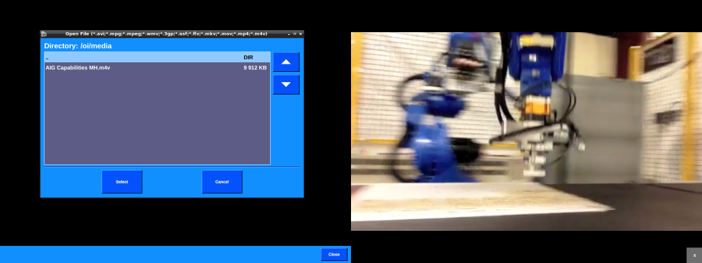
Video viewer provides a method to display a video. OI support avi, mpg, mpeg, wmv, 3gp, asf, flv, mkv, mov, mp4, and m4v files.
Useful for work instructions, safety, and training videos, the component can be configured to open a specific video or allow operators to select which video to display.
The player exits when the video ends.
Warning
Video Viewer is not supported in OI-windows. Please use Generic Run to launch a program of your choosing.
Camera Image Viewer

| Property | Values | Description |
|---|---|---|
| name | string | Provide a name for the component. This can be helpful when using the "Used Components" tool in the tag editor. |
| description | string | A space to provide a description of the current component, useful for documenting intent. |
| geometry | x, y, width, height (ints) | Sets the visible geometry of the component: x and y from top left corner, and width/height. Editing these values can be useful when positioning/sizing finer than grid snap is needed. |
| hideTag | tag | When tag value is an integer other than zero, the component is not displayed on the screen. |
| refreshTag | tag | Component will watch this tag to determine when to refresh data. See refreshOnEvent property. |
| refreshOnEvent | ZeroToNonZero, AnyChange | Determines when a change in the triggerTag will be used to trigger an action. ZeroToNonzero will trigger only when the tag value goes from zero to a non-zero value, and anyChange will trigger on any change in value. |
| refreshTime | int | Time in seconds that the contents of this component will be refreshed. |
| scaledImage | true, false | When true, scales the image to the size of the component. When false, the image is painted 1:1 scale, and any pixels outside the component area are not painted. |
| imageUrl | string | Sets the URL for the image to be displayed. |
| showLiveImageInOIB | true, false | When true, OIB will attempt to load the image specified in imageUrl and display the image in OIB. Helpful for debugging. |
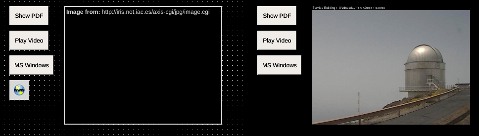
Camera viewer component displays and periodically reloads an image located at a URL. This is useful for showing images from network webcams, or other images available on a web server that change over time.
Camera RTSP Video Viewer
| Property | Values | Description |
|---|---|---|
| name | string | Provide a name for the component. This can be helpful when using the "Used Components" tool in the tag editor. |
| description | string | A space to provide a description of the current component, useful for documenting intent. |
| geometry | x, y, width, height (ints) | Sets the visible geometry of the component: x and y from top left corner, and width/height. Editing these values can be useful when positioning/sizing finer than grid snap is needed. |
| hideTag | tag | When tag value is an integer other than zero, the component is not displayed on the screen. |
| playVideoTag | tag | When non-zero, this component will attempt to play the video at the specified feed. When zero, no content will be loaded or displayed. |
| rtspVideoURL | URL | RTSP connection string for an RTSP feed. Supports username/password in the URL. Use format rtsp://user:password@rtsp_server.com |
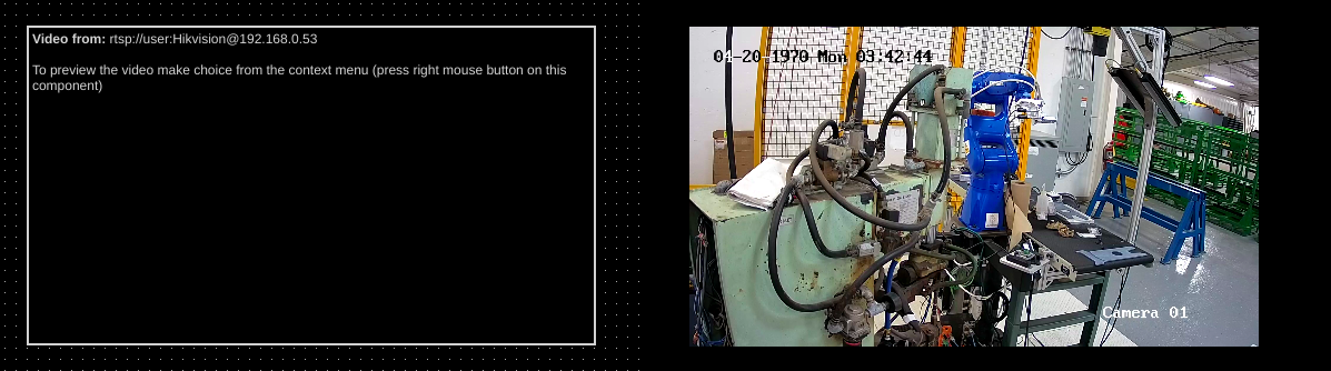
Camera viewer component displays an RTSP video feed.
Note
This feature is available in OI versions 1.11 and newer.
Warning
This component does not support transparent objects on top. OI will compose the view in the correct order, but will not have information regarding video pixels during composition so any objects above this component with transparency/translucency will act as if over a black background.
Embedded Video Player
| Property | Values | Description |
|---|---|---|
| name | string | Provide a name for the component. This can be helpful when using the "Used Components" tool in the tag editor. |
| description | string | A space to provide a description of the current component, useful for documenting intent. |
| geometry | x, y, width, height (ints) | Sets the visible geometry of the component: x and y from top left corner, and width/height. Editing these values can be useful when positioning/sizing finer than grid snap is needed. |
| hideTag | tag | When tag value is an integer other than zero, the component is not displayed on the screen. |
| playVideoTag | tag | When non-zero, this component will attempt to play the video at the specified feed. When zero, no content will be loaded or displayed. |
| videoFile | string | Filename of video to play. |
| autoLoop | true, false | If true, then video will automatically loop when ended. |
Video player that plays videos inline on a screen (as opposed to the traditional video viewer which plays in fullscreen). The root directory for video files are either c:\oiroot\oi for OI Win or the USB data card's oi-data directory for OI Embedded.
Note
This feature is available in OI versions 1.12 and newer.
Warning
This component does not support transparent objects on top. OI will compose the view in the correct order, but will not have information regarding video pixels during composition so any objects above this component with transparency/translucency will act as if over a black background.
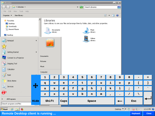
Remote Desktop Viewer
| Property | Values | Description |
|---|---|---|
| name | string | Provide a name for the component. This can be helpful when using the "Used Components" tool in the tag editor. |
| description | string | A space to provide a description of the current component, useful for documenting intent. |
| geometry | x, y, width, height (ints) | Sets the visible geometry of the component: x and y from top left corner, and width/height. Editing these values can be useful when positioning/sizing finer than grid snap is needed. |
| authorize | freeAccess, useLoggedUser, onEachAccess | Determines access protections for this component. |
| allowedGroups | int | Integer value for which groups should be allowed to interact with this component. |
| accessTimeout | seconds (int) | (deprecated) When set, this will persist authorization for access to the component for the time specified. |
| accessPassword | string | (deprecated) When set, this password is required to use the component. |
| hideTag | tag | When tag value is an integer other than zero, the component is not displayed on the screen. |
| foreColor | color | Sets foreground color (usually text). |
| backcolor | color | Sets background color. Images are allowed to set this to transparent to support images with alpha masks. |
| text | text | Sets the text that is displayed on the component. |
| textSize | int (points) | Sets the text size in points. |
| textBold | true, false | When true, the text will be displayed in heavier type. |
| image | image | The image that will be displayed. Images are selected from the applications image collection. |
| monoImage | true, false | When true, converts the image to black and white. |
| host | string | Sets the host remote desktop server to connect to. |
| client | vnc, rdesktop | Specifies whether to connect using VNC or Remote Desktop. |
| rdesktopUser | string | Sets the user to be used to connect to the remote computer. |
| rdesktopPassword | string | Sets the password to be used to connect to the remote computer. |
| vncDebug | true, false | If true, then more verbose logging is sent to /var/log/oi.log and a communication graph is displayed. |
The remote desktop viewer allows operators to connect to a remote computer directly from the OI terminal. The component support VNC and some Remote Desktop protocols.
Warning
Remote Desktop Viewer is not supported in OI-windows. Please use Generic Run to launch a program of your choosing.
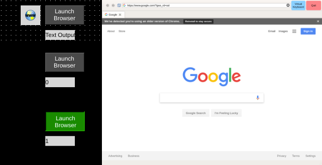
Browser
| Property | Values | Description |
|---|---|---|
| name | string | Provide a name for the component. This can be helpful when using the "Used Components" tool in the tag editor. |
| description | string | A space to provide a description of the current component, useful for documenting intent. |
| geometry | x, y, width, height (ints) | Sets the visible geometry of the component: x and y from top left corner, and width/height. Editing these values can be useful when positioning/sizing finer than grid snap is needed. |
| statusTag | tag | Tag specifies where the component will write its status to. See details for each component. Database components write 1 for error, 0 otherwise. |
| openTriggerTag | tag | Component will watch this tag to determine whether to trigger an action. See openTriggerOnEvent property. |
| openTriggerOnEvent | ZeroToNonZero, AnyChange | Determines when a change in the triggerTag will be used to trigger an action. ZeroToNonzero will trigger only when the tag value goes from zero to a non-zero value, and anyChange will trigger on any change in value. |
| closeTriggerTag | tag | Component will watch this tag to determine whether to trigger an action. See closeTriggerOnEvent property. |
| closeTriggerOnEvent | ZeroToNonZero, AnyChange | Determines when a change in the triggerTag will be used to trigger an action. ZeroToNonzero will trigger only when the tag value goes from zero to a non-zero value, and anyChange will trigger on any change in value. |
| startUpUrl | string | Sets the URL that will be loaded when the component opens. |
| redirectRFID | true, false | When true, RFID values will be passed through as keyboard events. |
The browser component provides the ability to visit a specific URL in a chrome-based web browser. The component itself is non-visual - it does not appear in runtime. Launching the browser is controlled through the openTriggerTag property. The browser can be closed manually or through the closeTriggerTag property.
Warning
Browser is not supported in OI-windows. Please use Generic Run to launch a program of your choosing, or use the Embedded Web Browser
Embedded Web Browser
| Property | Values | Description |
|---|---|---|
| name | string | Provide a name for the component. This can be helpful when using the "Used Components" tool in the tag editor. |
| description | string | A space to provide a description of the current component, useful for documenting intent. |
| geometry | x, y, width, height (ints) | Sets the visible geometry of the component: x and y from top left corner, and width/height. Editing these values can be useful when positioning/sizing finer than grid snap is needed. |
| authorize | freeAccess, useLoggedUser, onEachAccess | Determines access protections for this component. |
| allowedGroups | int | Integer value for which groups should be allowed to interact with this component. |
| accessTimeout | seconds (int) | (deprecated) When set, this will persist authorization for access to the component for the time specified. |
| accessPassword | string | (deprecated) When set, this password is required to use the component. |
| hideTag | tag | When tag value is an integer other than zero, the component is not displayed on the screen. |
| reloadTag | tag | Component will watch this tag to determine when to reload the homeUrl of the embedded web panel. |
| reloadOnEvent | ZeroToNonZero, AnyChange | Determines when a change in the triggerTag will be used to trigger an action. ZeroToNonzero will trigger only when the tag value goes from zero to a non-zero value, and anyChange will trigger on any change in value. |
| reloadTime | int | Time in seconds that the embedded web component’s homeUrl will be reloaded. |
| zoomPerc | int | Percentage zoom used to scale contents of embedded web panel. |
| showLiveInOIB | true, false | When true the embedded web viewer contents will be loaded and shown in OIB. |
| showToolBar | true, false | When true the browsers toolbar will be displayed at the top of the components contents. |
| homeUrl | string | Url that is loaded at startup and on reloads. |
| toolbarColor | color | Sets the background color of the toolbar (if toolbar is visible). |
The browser component provides the ability to visit a specific URL in a chrome-based web browser embedded within the OI application. Contrasted with the Browser Viewer, this component displays the web content within the bounds set by the geometry tag.
The reloadTag and reloadTime properties reload the Embedded Web Browser at the url specified in homeUrl. If a user has navigated to another page they will be returned to the homeUrl.