Push Button
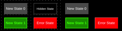
Left: Push button components in OIB. Right: Same components shown in OI run mode.
| Property | Values | Description |
|---|---|---|
| name | string | Provide a name for the component. This can be helpful when using the "Used Components" tool in the tag editor. |
| description | string | A space to provide a description of the current component, useful for documenting intent. |
| geometry | x, y, width, height (ints) | Sets the visible geometry of the component: x and y from top left corner, and width/height. Editing these values can be useful when positioning/sizing finer than grid snap is needed. |
| authorize | freeAccess, useLoggedUser, onEachAccess | Determines access protections for this component. |
| allowedGroups | int | Integer value for which groups should be allowed to interact with this component. |
| accessTimeout | seconds (int) | (deprecated) When set, this will persist authorization for access to the component for the time specified. |
| accessPassword | string | (deprecated) When set, this password is required to use the component. |
| hideTag | tag | When tag value is an integer other than zero, the component is not displayed on the screen. |
| readTag | tag | Tag specifies where to read the data that will be displayed. |
| writeTag | tag | Tag specifies where the component will write data on changes. |
| foreColor | color | Sets foreground color (usually text). |
| backcolor | color | Sets background color. Images are allowed to set this to transparent to support images with alpha masks. |
| foreBlink | true, false | When true, text will blink between transparent and foreColor. |
| backBlink | true, false | When true, the background will blink between backColor and blinkColor. |
| blinkColor | color | Sets the color the background will change to while blinking. |
| hidden | true, false | When true, the component will not be visible on the screen. |
| autorepeat | true, false | When true, the action of the button will be repeated while the button is held. |
| autorepeatDelay | int (milliseconds) | When autorepeat is enabled, this specifies the delay in milliseconds before the action is repeated. |
| autorepeatPeriod | int (milliseconds) | When autorepeat is enabled, this specifies the delay between repeating the action of the button. |
| pushValue | int | This sets the value that will be written to the writeTag when the button is in the pushed state. |
| releaseValue | int | This sets the value that will be written to the writeTag when the button is released following a push. |
| multiStatePushButton | true, false | When true, the push button will also act as a multi-state indicator. Each state can have its own display and push/release values. |
| holdTime | int (milliseconds) | When set to non-zero, the button will be held in the pushed state for this many milliseconds. |
| tagValue | int/string | In the state editor for the component, this sets the value of the state. When the tags value equals this value the component will select this state. If no state matches, the Error state will be displayed. |
| text | text | Sets the text that is displayed on the component. |
| textSize | int (points) | Sets the text size in points. |
| textBold | true, false | When true, the text will be displayed in heavier type. |
| borderWidth | int (pixels) | Set the size of the border in pixels. 0 removes the border. |
| image | image | The image that will be displayed. Images are selected from the applications image collection. |
| monoImage | true, false | When true, converts the image to black and white. |
| scaledImage | true, false | When true, scales the image to the size of the component. When false, the image is painted 1:1 scale, and any pixels outside the component area are not painted. |
| confirmationPanelNumber | int | The dynamic screen number that will be shown when the push button is pressed. |
| confirmationReadTag | tag | The tag that will be watched when the confirmation panel is shown. If the tag evaluates to 1 then the push button that triggered the panel writes the writeValue to its writeTag. If the tag evaluates to 2 then the panel is closed and no value is written. |
Push buttons are components whose display is determined by the state of their readTag, and allow operators to set the value of the writeTag.
Similar to multi-state indicators, push buttons support multiple states for both display and control. Each state can have a separate value that is written to the writeTag. Additionally, a separate value can be written while the button is pushed and when the button is released.
Push buttons also provide control over how OI interacts with the writeTag though the holdTime and autorepeat properties.
Push button states are created and set using the state editor.
Push buttons can require confirmation by using the confirmation related properties. For more information see also the Screens Section.