Screen Selectors
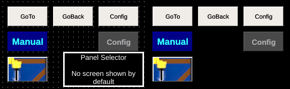
Screen selectors are specialized buttons that provide the ability to navigate screens on the OI terminal. They support customizing their appearance and using images in place of text.
Goto Screen
| Property | Values | Description |
|---|---|---|
| name | string | Provide a name for the component. This can be helpful when using the "Used Components" tool in the tag editor. |
| description | string | A space to provide a description of the current component, useful for documenting intent. |
| geometry | x, y, width, height (ints) | Sets the visible geometry of the component: x and y from top left corner, and width/height. Editing these values can be useful when positioning/sizing finer than grid snap is needed. |
| hideTag | tag | When tag value is an integer other than zero, the component is not displayed on the screen. |
| foreColor | color | Sets foreground color (usually text). |
| backcolor | color | Sets background color. Images are allowed to set this to transparent to support images with alpha masks. |
| text | text | Sets the text that is displayed on the component. |
| textSize | int (points) | Sets the text size in points. |
| textBold | true, false | When true, the text will be displayed in heavier type. |
| image | image | The image that will be displayed. Images are selected from the applications image collection. |
| monoImage | true, false | When true, converts the image to black and white. |
| gotoScreenNum | int | Sets the screen number that will be displayed when button is pushed. |
| password1 | string | (deprecated) When set, this password is required to use the component. Up to 5 passwords can be set for this component. If all are left blank, this method of authentication is not enabled. |
| password2 | string | (deprecated) When set, this password is required to use the component. Up to 5 passwords can be set for this component. If all are left blank, this method of authentication is not enabled. |
| password3 | string | (deprecated) When set, this password is required to use the component. Up to 5 passwords can be set for this component. If all are left blank, this method of authentication is not enabled. |
| password4 | string | (deprecated) When set, this password is required to use the component. Up to 5 passwords can be set for this component. If all are left blank, this method of authentication is not enabled. |
| password5 | string | (deprecated) When set, this password is required to use the component. Up to 5 passwords can be set for this component. If all are left blank, this method of authentication is not enabled. |
| confirmationPanelNumber | int | The dynamic screen number that will be shown when the push button is pressed. |
| confirmationReadTag | tag | The tag that will be watched when the confirmation panel is shown. If the tag evaluates to 1 then the push button that triggered the panel writes the writeValue to its writeTag. If the tag evaluates to 2 then the panel is closed and no value is written. |
The Goto screen button provides operators the ability to navigate between different OI screens.
Note
The PLC can also control which screen is displayed, see Application Settings for information about screen status and control tags.
Back Screen
| Property | Values | Description |
|---|---|---|
| name | string | Provide a name for the component. This can be helpful when using the "Used Components" tool in the tag editor. |
| description | string | A space to provide a description of the current component, useful for documenting intent. |
| geometry | x, y, width, height (ints) | Sets the visible geometry of the component: x and y from top left corner, and width/height. Editing these values can be useful when positioning/sizing finer than grid snap is needed. |
| hideTag | tag | When tag value is an integer other than zero, the component is not displayed on the screen. |
| foreColor | color | Sets foreground color (usually text). |
| backcolor | color | Sets background color. Images are allowed to set this to transparent to support images with alpha masks. |
| text | text | Sets the text that is displayed on the component. |
| textSize | int (points) | Sets the text size in points. |
| textBold | true, false | When true, the text will be displayed in heavier type. |
| image | image | The image that will be displayed. Images are selected from the applications image collection. |
| monoImage | true, false | When true, converts the image to black and white. |
| password1 | string | (deprecated) When set, this password is required to use the component. Up to 5 passwords can be set for this component. If all are left blank, this method of authentication is not enabled. |
| password2 | string | (deprecated) When set, this password is required to use the component. Up to 5 passwords can be set for this component. If all are left blank, this method of authentication is not enabled. |
| password3 | string | (deprecated) When set, this password is required to use the component. Up to 5 passwords can be set for this component. If all are left blank, this method of authentication is not enabled. |
| password4 | string | (deprecated) When set, this password is required to use the component. Up to 5 passwords can be set for this component. If all are left blank, this method of authentication is not enabled. |
| password5 | string | (deprecated) When set, this password is required to use the component. Up to 5 passwords can be set for this component. If all are left blank, this method of authentication is not enabled. |
| confirmationPanelNumber | int | The dynamic screen number that will be shown when the push button is pressed. |
| confirmationReadTag | tag | The tag that will be watched when the confirmation panel is shown. If the tag evaluates to 1 then the push button that triggered the panel writes the writeValue to its writeTag. If the tag evaluates to 2 then the panel is closed and no value is written. |
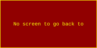
The Back Screen button provides a way to navigate to the previously shown screen. If there is no previous screen, and error is briefly displayed.
Warning
When pressed more than once, a the Back Screen button will not return to the startup screen, but will switch back and forth to the screen in which the button was originally pressed (the back button does not retain a history of screens visited, just the immediately preceding screen).
Config Screen
| Property | Values | Description |
|---|---|---|
| name | string | Provide a name for the component. This can be helpful when using the "Used Components" tool in the tag editor. |
| description | string | A space to provide a description of the current component, useful for documenting intent. |
| geometry | x, y, width, height (ints) | Sets the visible geometry of the component: x and y from top left corner, and width/height. Editing these values can be useful when positioning/sizing finer than grid snap is needed. |
| hideTag | tag | When tag value is an integer other than zero, the component is not displayed on the screen. |
| foreColor | color | Sets foreground color (usually text). |
| backcolor | color | Sets background color. Images are allowed to set this to transparent to support images with alpha masks. |
| text | text | Sets the text that is displayed on the component. |
| textSize | int (points) | Sets the text size in points. |
| textBold | true, false | When true, the text will be displayed in heavier type. |
| image | image | The image that will be displayed. Images are selected from the applications image collection. |
| monoImage | true, false | When true, converts the image to black and white. |
| password1 | string | (deprecated) When set, this password is required to use the component. Up to 5 passwords can be set for this component. If all are left blank, this method of authentication is not enabled. |
| password2 | string | (deprecated) When set, this password is required to use the component. Up to 5 passwords can be set for this component. If all are left blank, this method of authentication is not enabled. |
| password3 | string | (deprecated) When set, this password is required to use the component. Up to 5 passwords can be set for this component. If all are left blank, this method of authentication is not enabled. |
| password4 | string | (deprecated) When set, this password is required to use the component. Up to 5 passwords can be set for this component. If all are left blank, this method of authentication is not enabled. |
| password5 | string | (deprecated) When set, this password is required to use the component. Up to 5 passwords can be set for this component. If all are left blank, this method of authentication is not enabled. |
| confirmationPanelNumber | int | The dynamic screen number that will be shown when the push button is pressed. |
| confirmationReadTag | tag | The tag that will be watched when the confirmation panel is shown. If the tag evaluates to 1 then the push button that triggered the panel writes the writeValue to its writeTag. If the tag evaluates to 2 then the panel is closed and no value is written. |
Specialized screen selector that displays the Config screen on the OI terminal. See User Access for information about protecting access to the config screen.
Tip
Always make sure to include a Config Screen button in your application. If your application lacks a goto config button, you can access the config screen by:
modify the application, transfer to the OI terminal using FTP, and power cycle the OI
press on the bottom left of the screen (roughly 1/2in from the edges) for 2 seconds, then move your finger toward the center of the screen (it may take several attempts to do this)
interrupt communications (e.g. unplug network cable) and reboot. OI will default to config screen if there is a communication error
Panel Selector
| Property | Values | Description |
|---|---|---|
| name | string | Provide a name for the component. This can be helpful when using the "Used Components" tool in the tag editor. |
| description | string | A space to provide a description of the current component, useful for documenting intent. |
| geometry | x, y, width, height (ints) | Sets the visible geometry of the component: x and y from top left corner, and width/height. Editing these values can be useful when positioning/sizing finer than grid snap is needed. |
| readTag | tag | Tag specifies where to read the data that will be displayed. |
| transparentBackground | true, false | When true, the component does not fill in space around displayed elements. |
A component similar to Multi-State Indicators that embeds the contents of a dynamic panel within it's bounds. See Dynamic Panels for information about how the dynamic panels system works.
The top-left corner of the dynamic panel is located in the top-left of the Panel Selector component. The Panel Selector component then acts as a window onto the contents of the dynamic panel (content to the right or below the bounds of the Panel Selector window are not displayed).