# Indicators
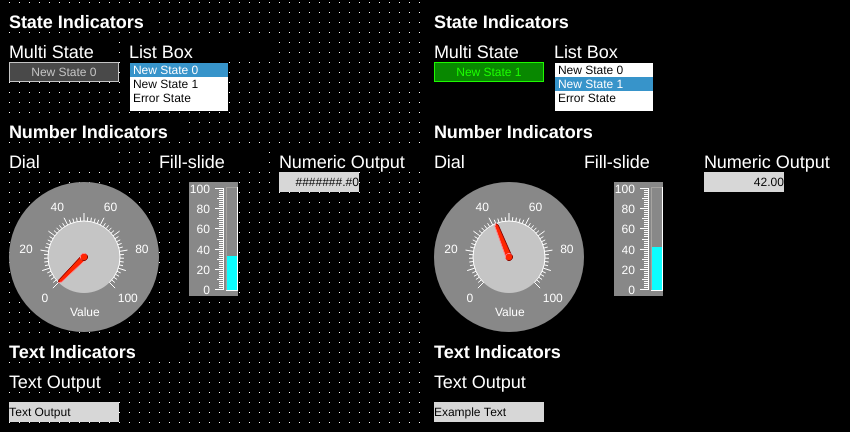
Left: Indicator components shown in OIB. Right: Indicator components shown in run mode
Indictors are dynamic components used to display tag values in different ways. These can be generally grouped by how they interpret tag values:
- State Indicators show discrete states based on the value of the tag
- Number Indicators show numeric values and can scale and round the value of the tag.
- Text Indicators show the tag value as a string.
# Multistate Indicators

Left: Multistate indicators in OIB showing various states. Right: Same indicators shown in OI run mode.
Multistate indicators are components whose display is determined by the state of their readTag. As the value of the readTag is changed, the state of the Multistate indicator is changed.
The component supports the ability to switch between thousands of states. If the readTag value goes to a state that is not in the list, the Error state will be displayed. These states can be customized using the State editor.
Multistate indicators support displaying text as well as images. Images are displayed by default in the center of the component and can be offset and rotated by using the Offset properties (these are applied to all states equally).
Rotation properties are global for all states - each state cannot be controlled individually.
Rotation only applies to the image, not the text.
Note
If offsetEnabled is true, offset is applied relative to the top left component corner.
Then rotation is applied around the rotationOrigin relative to the top left image (not component) corner.
If offsetEnabled is false, offset is ignored and rotation is applied around rotationOrigin relative to the image center.
To hide a particular state, set that state's hidden value to True.
# stateTextWriteTag
A multistate indicator can be used to write text values to a tag through the stateTextWriteTag property. When a tag is set here and the state changes for the multistate indicator, the text value of that state is written to that tag. This can be an effective way of mapping numeric states to text representations back to a database or the PLC.
# State ranges
Note
This feature is available with OI 1.11 Dec 30 2019 and newer.
Ranges of values instead of exact matches to values can be used to decide which state to display by using the "readTagValueLogic" property. This property determines how the readTag value is compared with the state's tagValue:
- Equal (=) (default)
- RangeGreater (>)
- RangeGreaterEqual (>=)
- RangeLesser(<)
- RangeLesserEqual (<=)
OI will sort the states by tagValue, and then evaluate:
- readTag value [Logic] state tagValue
Use the tool below to experiment and see how the different options affect the output.
| State: | Color: | tagValue |
| A | ||
| B | ||
| C | ||
| D | ||
| Error | Error |
| readTag Value: | Equal | Range Greater | Range Greater Equal | Range Lesser | Range Lesser Equal |
| -1 | A: -1 <= 1 | A: -1 <= 1 | |||
| 0 | A: 0 <= 1 | A: 0 <= 1 | |||
| 1 | A: 1 = 1 | A: 1 >= 1 | B: 1 <= 4 | A: 1 <= 1 | |
| 2 | A: 2 > 1 | A: 2 >= 1 | B: 2 <= 4 | B: 2 <= 4 | |
| 3 | A: 3 > 1 | A: 3 >= 1 | B: 3 <= 4 | B: 3 <= 4 | |
| 4 | B: 4 = 4 | A: 4 > 1 | B: 4 >= 4 | C: 4 <= 7 | B: 4 <= 4 |
| 5 | B: 5 > 4 | B: 5 >= 4 | C: 5 <= 7 | C: 5 <= 7 | |
| 6 | B: 6 > 4 | B: 6 >= 4 | C: 6 <= 7 | C: 6 <= 7 | |
| 7 | C: 7 = 7 | B: 7 > 4 | C: 7 >= 7 | D: 7 <= 10 | C: 7 <= 7 |
| 8 | C: 8 > 7 | C: 8 >= 7 | D: 8 <= 10 | D: 8 <= 10 | |
| 9 | C: 9 > 7 | C: 9 >= 7 | D: 9 <= 10 | D: 9 <= 10 | |
| 10 | D: 10 = 10 | C: 10 > 7 | D: 10 >= 10 | D: 10 <= 10 | |
| 11 | D: 11 > 10 | D: 11 >= 10 |
Download the State Range sample application
# Numeric Output

Left: Numeric Output in OIB. Right: Same component shown in OI run mode.
Numeric outputs display numeric values of data referenced through the readTag.
Numeric outputs support displaying up to twelve characters. Numeric outputs also provide control of the displayed number through the decimalPointPosition, fillWithZeroes, scale, and passwordMode.
# Text Output

Left: Text output in OIB. Right: Same component shown in OI run mode.
Text outputs display string/character array values of data referenced through the readTag.
# List Box

Left: Listbox in OIB. Right: Same component shown in OI run mode.
List boxes are used to simultaneously display a series of states, and to highlight the current state indicated by the readTag.
Listbox options are set using the state editor for the component.
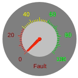
# Dial
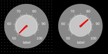
Left: Dial indicator in OIB. Right: Same component shown in OI run mode.
Dial indicators display numeric data referenced through the readTag through the use of a radial dial (analogous to a pressure gauge).
Dials support states for several properties. See the notes under Multistate Indicators for State Ranges.
Tick marks and numbers will show the colors they will be in for the calculated state. Other properties will change as the value changes.
# Fill Slide

Left: Fill slide in OIB. Right: Same component shown in OI run mode.
Fill slides display numeric data referenced through the readTag through the use of a linear bar.